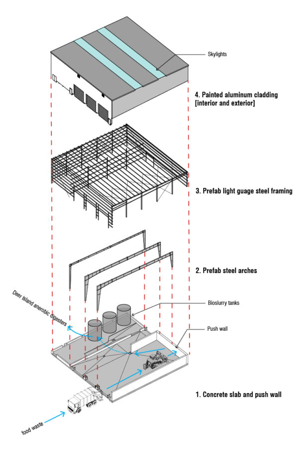
From one of our industrial projects, the CORe Recycling Facility in Charlestown for Waste Management and Save That Stuff, this diagram shows both the process flow through the space and the building components. This was a prefab building, adapted for this site and use, and required us to think carefully about maximizing maneuvering room, storage, and keeping an efficient flow through the space.
Sometimes we make diagrams like this to help us understand something as we’re designing, and sometimes we make them afterwards, to help explain the project to clients, or to help clients with fundraising, investor interest, etc. Usually the version we make during design phases are messy – the classic “napkin sketch” – and then we clean them up to make them clearer. We find that the thinking that goes into our work, and the logic behind the organization of space or selection of materials or integration of mechanical/plumbing/electrical and other engineered systems can go unseen. In fact, it should – being in a well designed space should feel seamless, easy, and natural – and to do that, it takes *a lot* of planning! These diagrams help reveal the underlying logic, and the behind-the-scenes thinking, that goes into our work.
In this particular project, trucks enter the facility with organic waste, dumping it on the floor for the bulldozer to squish up against a concrete “push wall.” Once the material has reached the desired consistency, it’s piped into a series of mechanical processors to remove unwanted items like packaging or utensils, then combined with other organic waste liquids. The resulting material, called “Engineered Bioslurry,” is a delicious meal for the digesters at the wastewater treatment plant in Lawrence, MA, which in turn generate electricity to power our homes and businesses.
This facility is one of only 4 in the nation, and we’re proud to have worked on it. We love our industrial projects!
More on this project >>>